On notebook choice
Few things define a person more than his choice of notebook. Moleskine, Field Notes, Leuchtterm, Nock: each choices broadcasts something different.
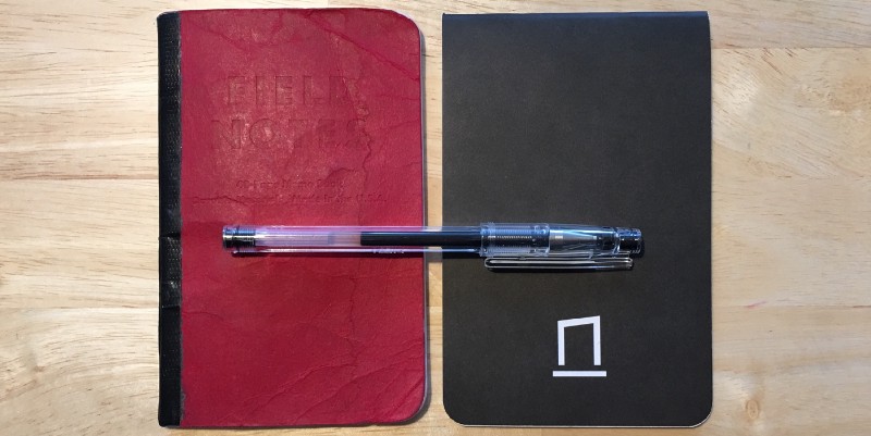
For several years I have been a proud user of Field Notes. I enjoyed their size and durability (most notably their ability to stand dunking in rivers, even in the standard paper version) and variance in their colour options.
When Nock Co. introduced their DotDash notebooks, and I bought a pack of three. I casually started using one as my kitchen notebook, and noticed but didn’t consider how nicely the ink of my Uni Power Tank wrote on it (but it writes well on almost everything), and how pleasant the notebook was to hold.
Hitting page 46 of my last FN, I started to think about its replacement. I initially chose one of the beautiful fall colours to be my next notebook, but was annoyed to notice that when I added duct tape to the spine for its reinforcement, the double-cover started to separate. Sulk. Bin.
I briefly flirted with a Leuchtterm as my replacement: it has page numbers, an index page, excellent paper, and removable pages at the back — what more could one ask for? — but I couldn’t get a gridded Jottbook Pocket (A6) in time.
Sitting on the side of my table was a DotDash Pocket Notebook, with its bold dot dash grid and racey top staple. I dislike the form fields on the inside cover, and will print my own to paste over it, but beyond that it’s lovely.
The paper takes the ink from my Pilot G-Tec C4 beautifully. I look forward to seeing how it holds up over the next 45 pages, as the cover feels a little more ‘papery’ than on the FN. The question that remains: do I write in portrait or landscape?

Comments ()